Overview
Description
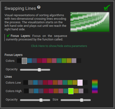
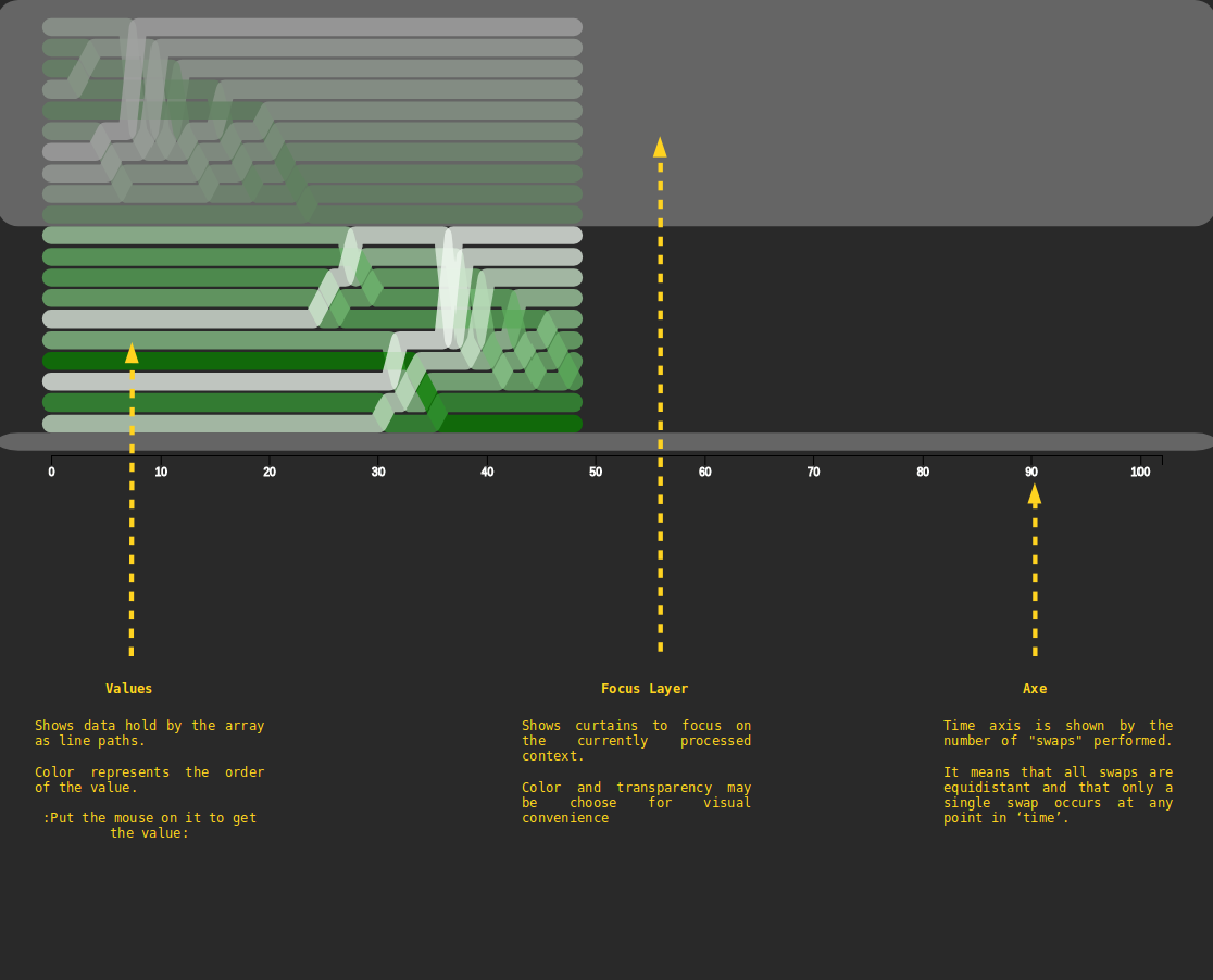
Show data held by the array with a timeline of swapping operations repsented as crossing lines. It shows values, indexes, focus layers (current scope) and traces let by swap operations.
We begin on the left hand side with the numbers in order from top (i = 0) to bottom (i = n - 1), and the algorithm plays out until we reach the right hand side (when the process is done).
The magnitude of a value is indicated by the color - higher numbers are (by default) greener, and lower numbers are (by default) whiter.
Time, in this particular case, is measured by the number of "swaps" performed. This means that all swaps are equidistant on the diagram, and that only a single swap occurs at any point in time.
Inspired by Sortvis.org, it was initially made to visualize and help to understand, step by step, how sorting algorithms work. Another characteristic of this visualizer is the ability to provide a static picture of swapping operations and therefore a visual way to find patterns in our processes.
When we translate time to a geometric length, as is done in any scientific diagram with a time dimension, this estimation process becomes easy. The specific technique used here only works when the sorting algorithm is in-place, i.e. does not use any storage external to the array itself.
Parameters